Sample works
Turn experimental data into clear statistical plots
Create statistical plots and charts for comparisons, trends, correlations, and experiment results.
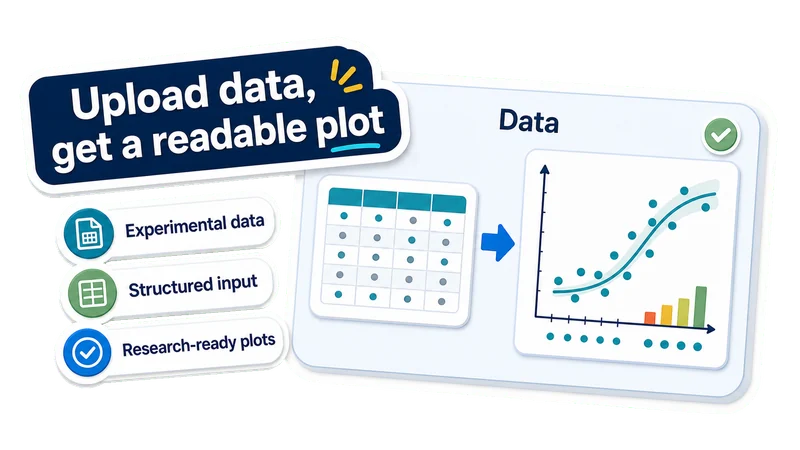
Upload data, get a readable plot
Experimental data
Use variables, groups, measurements, metrics, or time points.
Structured input
Upload supported data files with clear columns, records, or grouped observations.
Research-ready plots
Create plots for papers, posters, slides, and lab reports.
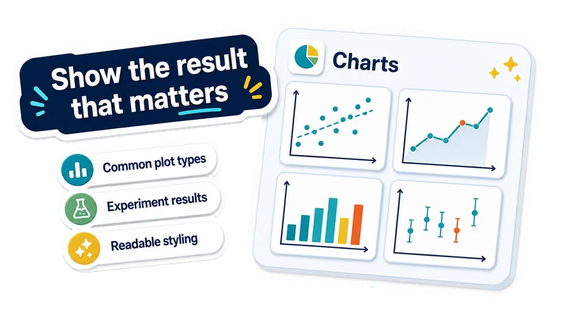
Show the result that matters
Common plot types
Create scatter, line, bar, correlation, grouped, and error-bar plots.
Experiment results
Visualize dose response, time courses, group differences, and model metrics.
Readable styling
Get clearer axes, labels, legends, spacing, and hierarchy.
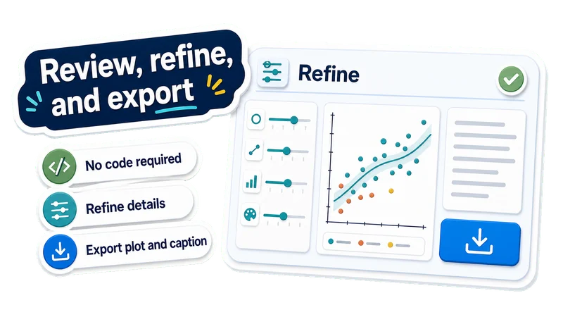
Review, refine, and export
No code required
Generate a statistical plot without writing plotting code from scratch.
Refine details
Change chart type, labels, colors, layout, legend, statistics, or axes.
Export plot and caption
Download the statistical plot and caption for papers, posters, or slides.
Create a statistical plot in 3 steps
Upload experimental data, describe what the plot should show, then review and refine the generated chart.
Upload experiment data
Choose a supported data file with variables, groups, measurements, metrics, or time points.
Describe the plot intent
Tell EZFigure what the chart should compare, reveal, or emphasize.
Review and export the plot
Check labels, axes, legend, plotted values, and caption, then refine the chart before downloading it.
AI Statistical Plot FAQ
Answers to common questions about turning experiment data into statistical plots, graphs, and charts.
Create a statistical plot from your data
Upload experimental data and create a clear statistical plot you can review, refine, caption, and use in papers, posters, or slides.